You order 5,000 promotional bucket hats. You pick navy blue because it is safe. The event happens. Your booth looks like a funeral. The booth next to you gives away bucket hats in a fresh, unexpected color. The crowd swarms their booth. Your navy hats sit in a box. You saved money on a safe color. You lost money on missed engagement. Color is a competitive weapon. Safe is risky.
The key Spring/Summer 2026 color trends for promotional bucket hats are Digital Lavender, Solar Orange, Aqua Blue, Sage Green, and Butter Yellow. Digital Lavender is a soft, tech-infused purple that signals calm and creativity. Solar Orange is a bold, optimistic shade that demands attention in a crowd. Aqua Blue is a refreshing, cooling tone that evokes coastal clarity. Sage Green is a grounded, natural shade linked to sustainability messaging. Butter Yellow is a warm, gentle pastel that feels approachable and cheerful.
I track color trends through Pantone, WGSN, and the actual orders my factory receives from major fashion brands. The bulk orders I cut in January are the truest forecast. The colors the big brands order today are the colors the promotional market wants six months later.
Why Is Digital Lavender the Dominant Pastel for Promotional Headwear?
You think purple is a niche color. It feels risky. It feels feminine. You skip it. You miss the trend. Digital Lavender is not the purple of the past. It is a neutral pastel that reads as genderless and futuristic. It is the color of the digital wellness movement. It photographs beautifully on social media. It pops against both light and dark backgrounds.
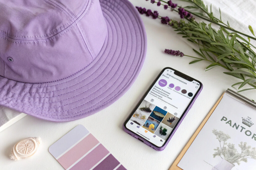
Digital Lavender is the dominant pastel for Spring/Summer 2026 promotional headwear because it bridges the wellness trend and the digital aesthetic. It is associated with calm, focus, and creativity. It works for tech brands, health brands, and lifestyle brands equally. It pairs well with white logos for a clean look, or with neon green for a high-contrast streetwear look.
I cut more lavender bucket hat bodies in Q1 2026 than any other pastel. The orders came from a yoga festival, a software company's developer conference, and a skincare brand's summer pop-up. Three different industries. One color.
Digital Lavender is not one fixed shade. The Pantone code has a specific formulation. The fabric type changes the perceived color.
How Does the Pantone 2026 Color of the Year Influence Bucket Hat Production?
Pantone has not officially named Digital Lavender as the 2026 Color of the Year at the time of writing, but the trend forecasters at WGSN and Coloro have identified it as a key color for the season. The fashion supply chain moves ahead of the official announcement. Fabric mills prepare the dyed stock before the public knows.
The influence on bucket hat production is direct. The mills offer the color in their seasonal forecast palettes. The factories buy the fabric. The promotional product distributors see the color at trade shows and include it in their catalogs. The Pantone system creates a common language. A buyer says "Pantone 2026-15" and the factory knows exactly what to dye.
I stock Digital Lavender fabric in cotton twill and nylon ripstop. The cotton version has a softer, muted feel. The nylon version has a slight sheen that looks more tech-forward. Both are selling.
Which Logos and Brand Messages Pair Best With Lavender Headwear?
Lavender signals creativity, calm, and digital innovation. It does not signal aggression, urgency, or tradition. A bank would look off-brand with a lavender bucket hat. A meditation app, a design agency, or a co-working space would look perfectly on-brand.
White logos on lavender are the cleanest combination. The contrast is high but not harsh. Black logos on lavender look heavier. A metallic silver or holographic foil print on lavender looks premium and futuristic.
I advise my promotional product clients to match the color to the event vibe. A tech hackathon: lavender with a neon green logo. A wellness retreat: lavender with a white debossed logo. A summer music festival: lavender with a holographic print. The color psychology of lavender is versatile but specific. Use it right.
How Does Solar Orange Perform as a High-Visibility Giveaway Color?
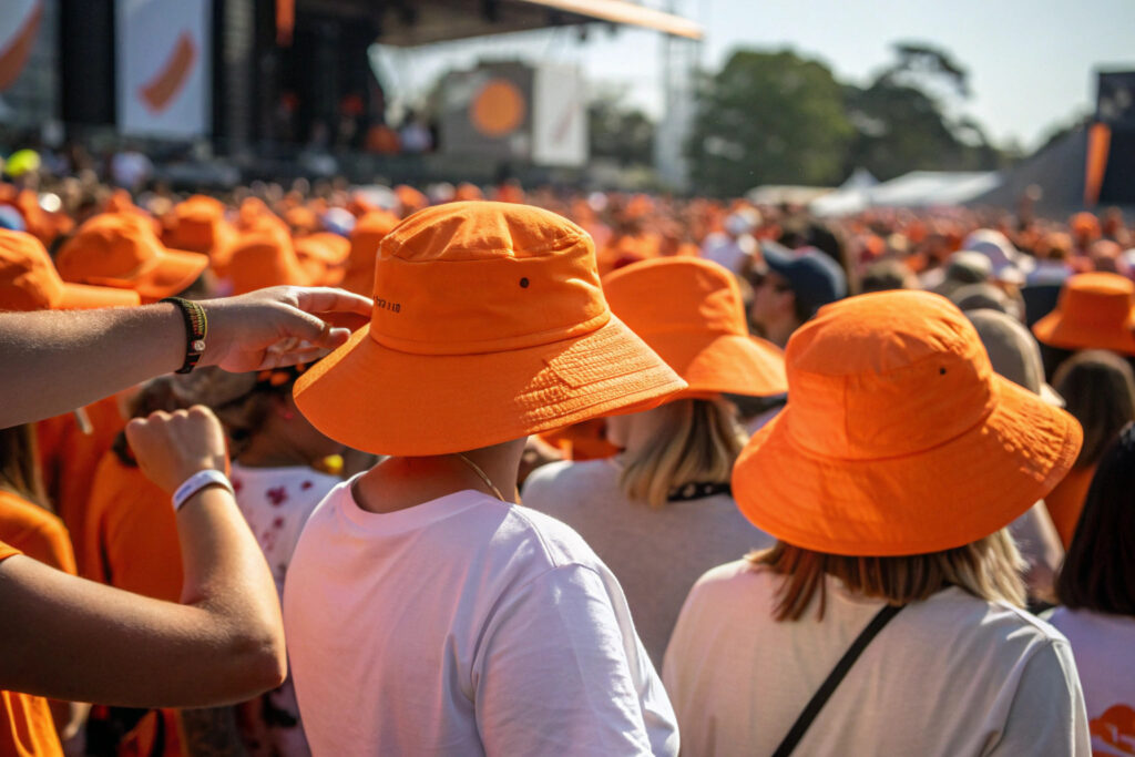
You give away hats at a music festival. You want people to find your brand ambassadors in the crowd. You pick a dark grey hat. The ambassadors disappear. You pick Solar Orange. They are visible from 200 meters away. The hat is a beacon. People walk towards the orange. The color does the recruiting for you.
Solar Orange performs as a high-visibility giveaway color because it has the longest wavelength in the visible spectrum after red. The human eye detects orange faster than blue or green in peripheral vision. In a crowded event space, an orange hat is a signal flare. It also photographs with high saturation, making it ideal for social media content.
I produce Solar Orange bucket hats for sports events, charity walks, and summer music festivals. The color communicates energy, enthusiasm, and fun. It is the opposite of corporate grey.
The specific shade of orange matters. A neon orange and a burnt orange have completely different brand associations.
What Is the Difference Between Neon Orange and Burnt Orange in Fabric Dyeing?
Neon orange contains fluorescent pigments that absorb UV light and re-emit it as visible light. The color appears to glow, especially in sunlight. It is achieved with special fluorescent disperse dyes on polyester or reactive fluorescent pigments on cotton. The dye cost is higher.
Burnt orange is a muted, earthy orange. It contains no fluorescent agents. It is achieved with standard reactive dyes. It has a retro, 1970s aesthetic. It is less aggressive and more fashion-oriented.
I stock both neon orange and burnt orange fabrics. The neon orange is 15% more expensive to dye. It sells three times more volume in the promotional market. The burnt orange sells better in the fashion boutique market. Choose neon orange for maximum visibility at a corporate event.
Does Bright Orange Fabric Fade Faster Under Sunlight Than Darker Colors?
Yes. Bright orange dyes, especially fluorescent dyes, have lower lightfastness than dark or dull dyes. The fluorescent molecule is chemically less stable under UV radiation. It degrades. The color fades to a pale peach after prolonged sun exposure.
The standard test for lightfastness is AATCC 16. A Grade 4 rating means the color shows a slight change after 40 hours of xenon arc exposure. A typical fluorescent orange might achieve Grade 3. A dark navy might achieve Grade 5.
I warn my promotional clients about this. If the bucket hat will be worn for a single event day, the fade is irrelevant. If it is intended as a long-term wearable product, I recommend a non-fluorescent orange with a higher lightfastness rating. I also offer a UV inhibitor treatment for the fabric that extends the color life.
Why Are Aqua Blue and Sage Green Leading the Eco-Messaging Palette?
Your brand has a sustainability message. You print it on a petroleum-based polyester hat in electric pink. The color contradicts the message. The customer is confused. The color is the first thing they see. The message is the second. If they clash, the message loses credibility.
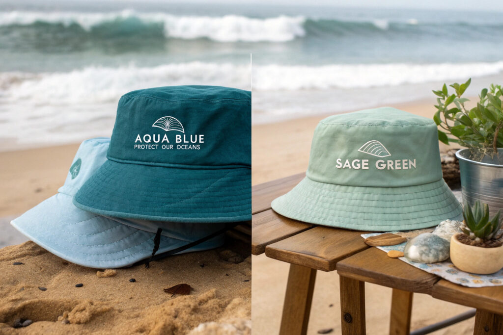
Aqua Blue and Sage Green lead the eco-messaging palette because they are the colors most associated with clean water, healthy plants, and environmental responsibility. Aqua Blue evokes the ocean, the sky, and fresh water. It is the color of marine conservation, clean beaches, and water charity campaigns. Sage Green evokes leaves, herbs, and the earth. It is the color of organic farming, vegan brands, and reforestation projects.
I produce eco-messaging bucket hats in these two colors for NGOs, sustainable fashion brands, and corporate CSR events. The color tells the story before the customer reads the logo.
The fabric composition must match the color message. A synthetic bright blue sends a different signal than a natural muted blue.
How Does the "Ocean Bound Plastic" Narrative Connect to Aqua Blue Caps?
Ocean Bound Plastic is recycled polyester made from plastic bottles collected within 50 kilometers of coastlines. The material story is about preventing ocean pollution. The color story of Aqua Blue is about the ocean itself. The material and the color reinforce each other.
A bucket hat made from ocean-bound plastic in Aqua Blue is a unified marketing message. The customer wears the ocean on their head, literally and symbolically. The color reminds them of the cause. The material is the cause.
I produce an Aqua Blue bucket hat using certified ocean-bound plastic yarn. The QR code inside the sweatband links to the collection data. The color and the traceability work together. This is the most effective promotional product for marine conservation organizations.
Can a Sage Green Bucket Hat Reinforce a Brand's Organic or Vegan Identity?
Yes. Sage Green is the color of plant-based living. It is the color of matcha tea, avocado, and herb gardens. A vegan food brand using a sage green bucket hat at a trade show is visually coherent. The customer sees the color and immediately categorizes the brand as natural, plant-based, and ethical.
The material choice amplifies the message. An organic cotton bucket hat in sage green is a double signal. The color says "plant." The material says "organic." The combination is a powerful brand shorthand.
I supply Sage Green organic cotton hats to vegan food companies and natural skincare brands. The feedback is consistent. The hat reinforces the brand identity without needing to read the logo. The color psychology of sage green is calm growth.
How to Match Pantone Colors Accurately on Bulk Bucket Hat Fabrics?
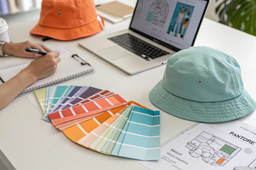
You pick a beautiful Pantone color from the book. The bulk hats arrive. The color is noticeably different. It is darker, muddier, or more saturated. You complain. The factory says "Textile dyes cannot match paper Pantone chips exactly." They are partially right. But a good factory gets close.
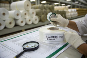
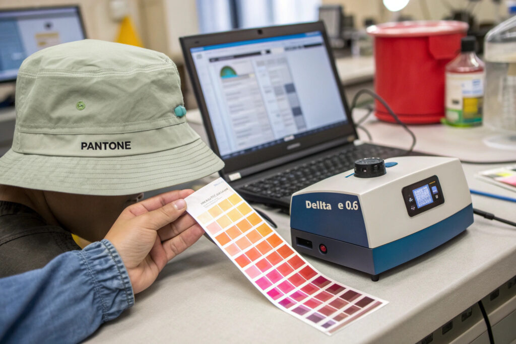
You match Pantone colors accurately on bulk bucket hat fabrics by using a spectrophotometer to measure the Delta E between the dyed lab dip and the Pantone reference, and by setting a commercial tolerance of Delta E 1.5 or less. You also approve a physical lab dip on the actual bulk fabric, not just a paper chip. The paper Pantone is the target. The fabric lab dip is the achievable reality.
I never promise a 100% match between a paper Pantone and a dyed textile. I promise a Delta E 1.0 or less on the spectrophotometer reading. The numbers do not lie. The human eye is fooled by lighting.
The fabric substrate changes the color appearance. The same dye on cotton and on nylon looks different. The lab dip must be on the exact bulk fabric.
What Is the Delta E Tolerance for Commercial Color Matching?
Delta E is the mathematical distance between two colors in the CIELAB color space. A Delta E of 0 is a perfect match. A Delta E of 1.0 is visible only to a trained eye under controlled lighting. A Delta E of 2.0 is visible to the average consumer. A Delta E of 3.0 looks like a different color.
The commercial standard for acceptable color matching in the apparel industry is Delta E CMC 1.5 or less. The CMC formula weights the tolerance based on how the human eye perceives color differences. It is stricter in the orange region and more lenient in the deep green region.
I set my Delta E tolerance at 1.5 for all bucket hat fabrics. If the lab dip measures 1.6, the dye house reformulates. The spectrophotometer is the objective judge. I use a Datacolor spectrophotometer for all color approvals.
Why Does the Substrate Material Affect the Final Color Appearance?
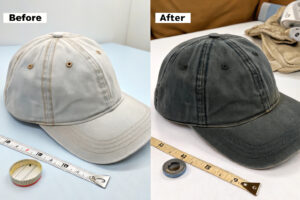
The same dye recipe on cotton and on polyester produces a different color. Cotton is a cellulose fiber. The dye penetrates the fiber and bonds chemically. Polyester is a synthetic polymer. The dye is dispersed inside the fiber under heat. The light interacts differently with the two dyed fibers. The cotton version often looks slightly duller. The polyester version often looks slightly brighter with more sheen.
The weave structure also matters. A twill weave scatters light differently than a plain weave. A brushed finish scatters light more than a smooth finish. The color looks lighter on a brushed surface.
I always dye the lab dip on the exact same fabric substrate as the bulk order. The client approves the lab dip on the actual hat fabric, not on a generic cotton swatch. This prevents the substrate mismatch surprise.
Conclusion
The key Spring/Summer 2026 color trends for promotional bucket hats are Digital Lavender, Solar Orange, Aqua Blue, Sage Green, and Butter Yellow. Each color serves a specific brand message. Digital Lavender dominates the wellness and tech space with its calm, creative energy. Solar Orange commands attention at outdoor events and sports activations. Aqua Blue and Sage Green lead the eco-messaging palette, visually reinforcing sustainability narratives. Butter Yellow adds warmth and approachability.
The color choice is a strategic decision. The color must match the brand message, the event context, and the target audience. A safe color like navy blue is a missed opportunity. A bold trend color is an engagement multiplier.
Accurate color matching requires a disciplined process. The Pantone paper chip is the target. The fabric lab dip is the reality. A spectrophotometer measures the Delta E. The tolerance is 1.5 or less. The lab dip must be on the exact bulk fabric substrate.
At Global-Caps, I track color trends through my order book, not just trend reports. The colors my factory is cutting today are the colors your customers will want tomorrow. My dye lab can match any Pantone reference and produce a lab dip for your approval within 5 days.
If you need promotional bucket hats in the trending Spring/Summer 2026 colors, contact my Business Director Elaine. She can send you our seasonal color card with fabric swatches and arrange a lab dip for your custom Pantone match. Email Elaine at elaine@fumaoclothing.com. Let's color your next promotion with confidence.