I once received a purchase order from a new client with the instruction: "Logo on front, centered, standard size." That was the entire specification. I called him. I asked, "What is standard size? Do you mean 50 millimeters wide? 60? Do you want it centered between the seams, or centered on the wearer's forehead? Is the distance from the brim 25 millimeters or 40?" He paused. He had not thought about any of these questions. He just assumed the factory would know. We stopped production before it started. We spent three days going back and forth with sketches, photos, and measurements. We finally locked the placement. The caps shipped correctly. The client later told me his previous factory had embroidered the logo too high, too small, and off-center on three consecutive orders because he had used the same vague instruction each time.
The best way to communicate complex logo placement to a hat factory is to use a combination of a visual mockup, numerical measurements from fixed reference points, and a physical pre-production sample approval. The visual mockup, ideally a digital 3D rendering or a photo-shopped image of the logo on the actual hat style, establishes the intended look. The numerical measurements define the exact position using three reference points: the distance from the center front seam to the top of the logo, the distance from the brim attachment to the bottom of the logo, and the left-right centering tolerance relative to the center seam. The pre-production sample approval is the physical confirmation that the factory has interpreted the visual and the numerical correctly. Without all three elements, you are communicating a hope, not a specification. With all three, you are communicating an engineering instruction that a competent factory can execute with precision.
I have built our sampling and production workflow around this three-element communication system. It has eliminated the logo placement errors that plagued our early years. I want to share the exact method, the measurement reference points, the tools for creating a visual mockup, and the approval checklist that locks the logo position before bulk production begins. This is how you stop guessing and start specifying.
Why Are Visual Mockups More Effective Than Written Descriptions for Logo Placement?
A written description is an act of translation. The brand owner has a visual image in their mind. They translate that image into words. The factory project manager reads those words and translates them back into a visual image. Each translation step introduces error. The error compounds. "Centered" means geometrically centered between the seams to one person and optically centered on the forehead to another. "Standard size" means 55 millimeters to one factory and 65 millimeters to another. "A little above the brim" means 20 millimeters to one eye and 35 millimeters to another. Language is ambiguous. A visual is specific.
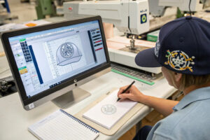
I require every client to provide a visual mockup before we digitize an embroidery file. The mockup does not need to be professionally rendered. It can be a smartphone photo of a similar hat with the logo roughly sized and positioned using a free image editing app. It can be a pencil sketch scanned and emailed. It can be a PowerPoint slide with a hat photo and a logo pasted on. The purpose of the visual mockup is not to be beautiful. It is to remove the translation error. When I look at the mockup, I see exactly where the client imagines the logo sitting. I can then measure the mockup, calculate the real-world dimensions, and ask specific clarifying questions: "I see you have placed the logo approximately 30 millimeters above the brim. Is that correct?" The conversation shifts from "where do you want it" to "is this measurement correct." The visual specification methodology is standard practice in professional apparel manufacturing. The visual answers questions that words cannot ask.
The visual mockup is the shared reference image. But a visual alone is not enough. A photo of a hat with a logo pasted on does not specify the exact size in millimeters. The logo on the screen might be larger or smaller than the intended physical size. The visual must be paired with a dimensional callout.

What Is the Ideal File Format for a Logo Placement Mockup?
The ideal file format is a PDF or a high-resolution JPEG that shows the hat front panel straight-on, not at an angle, with the logo placed at the intended position. The image should be taken with the hat mounted on a head form or a flat surface, not worn on a head, because a head introduces curves that distort the perceived position. The camera should be positioned directly in front of the hat, at the height of the logo, perpendicular to the front panel. An angled photo introduces perspective distortion that shifts the apparent logo position.
If the client cannot produce a digital mockup, I accept a physical mockup. They take a similar hat, print the logo on paper, cut it out, tape it to the hat, and photograph the result. This physical mockup is often more accurate than a digital one because the client can feel the size and position in their hands. The mockup creation tools available online make this process accessible to any brand, regardless of design budget.
How Does a 3D Digital Sample Eliminate Placement Ambiguity Entirely?
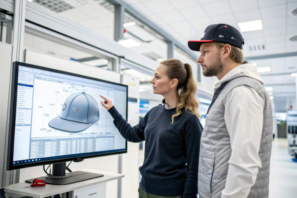
A 3D digital sample is the most powerful placement communication tool available. I use software that creates a photorealistic, rotatable 3D model of the exact hat style the client has selected. The client's logo is mapped onto the 3D model. The client can view the hat from the front, the side, the back, and the top. They can zoom in on the logo. They can see the logo in relation to the curved seams, the brim, and the sweatband. They can request a change, such as "move the logo down by 5 millimeters," and I can update the 3D model in minutes.
The 3D sample eliminates the "I'll know it when I see it" problem. The client sees it immediately. They approve the digital placement. That digital placement is then converted directly into the embroidery digitizing file coordinates. There is no manual translation step. The digital position is the physical position. The 3D sampling technology has transformed the speed and accuracy of logo placement communication. I use it for every new logo design.
What Are the Critical Reference Points for Measuring Logo Position on a Cap?
A logo on a cap does not float in empty space. It sits on a curved, seamed, structured surface. Its position can only be defined relative to fixed, visible features on that surface. The three critical reference points on any cap are the center front seam, which is the vertical line running from the top button to the brim. The brim attachment line, which is the horizontal line where the fabric crown meets the visor. And the left and right side seams, which define the lateral boundaries of the front panel. Every logo placement specification must reference at least two of these three points.
I define logo position using a simple coordinate system. The X-axis is horizontal, with zero at the center front seam. The Y-axis is vertical, with zero at the brim attachment line. The logo position is specified as the X distance from the center seam to the left edge of the logo and the right edge of the logo, which also defines the centering. And the Y distance from the brim attachment line to the bottom edge of the logo. For example, a specification might read: "Logo to be centered on the center front seam. Bottom edge of logo to be 30 millimeters above the brim attachment line. Logo width to be 55 millimeters, symmetric about the center seam." This specification leaves zero ambiguity. The embroidery machine operator or the screen printer can measure these distances, mark the position on the cap, and place the logo exactly. I also specify a tolerance. For embroidery, the tolerance is plus or minus 2 millimeters on both axes. For a human-operated machine on a curved fabric surface, a tighter tolerance is not realistic. A tolerance of plus or minus 1 millimeter is achievable with a laser positioning system, but standard embroidery machines use a needle-point laser guide that is manually aligned. The tolerance must match the manufacturing process capability.
The center seam and the brim line are the primary reference points. But a cap is a three-dimensional curved object. The measurement on a flat ruler does not perfectly represent the measurement on the curved crown. The measurement method must account for the curve.
How Do You Measure Logo Position on a Curved Cap Crown?
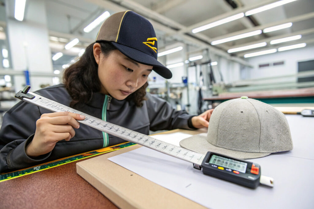
A rigid ruler placed on a curved cap front panel does not follow the curve. The distance measured along the curve, which is the actual fabric distance, is longer than the straight-line distance between the same two points. If the specification says "30 millimeters from the brim," but the method does not specify whether this is a straight-line distance or a curve-following distance, the result will vary.
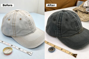
I specify that all logo placement measurements are taken with a flexible tailor's tape measure that follows the curve of the cap. The tape is placed at the reference point, the brim attachment line, and run vertically up the center seam. The 30-millimeter mark is the target for the bottom edge of the logo. The same curve-following method is used for the horizontal measurement from the center seam to the side seams. The curved surface measurement method is standardized in our QC procedure. Every inspector uses the same flexible tape and the same curve-following technique.
What Is the Difference Between Optical Centering and Geometric Centering?
Geometric centering places the logo exactly equidistant between the left and right side seams. This is mathematically correct. Optical centering adjusts the position slightly to account for the way the human eye perceives balance. A logo that is geometrically centered on a cap with an asymmetrical brim curve or an off-center sweatband seam may look visually off-center when worn.
I always specify geometric centering for the production measurement. This is objective and measurable. Optical centering is a design judgment that is made during the visual mockup stage. If the mockup shows that geometric centering looks wrong, the designer adjusts the position in the mockup and then specifies the new, optically centered measurement. The production specification is always a geometric measurement from a fixed reference point. The optical versus geometric centering distinction is a classic design principle that applies directly to logo placement on curved headwear.
What Information Should a Logo Placement Tech Pack Include?
The tech pack is the engineering drawing for the factory floor. It translates the visual mockup and the client's wishes into a technical language that a production operator can execute. A complete logo placement tech pack contains a dimensioned drawing, a written specification, a thread and material specification, and a reference to the approved pre-production sample. Without a tech pack, the production run is guided by memory. Memory fails.
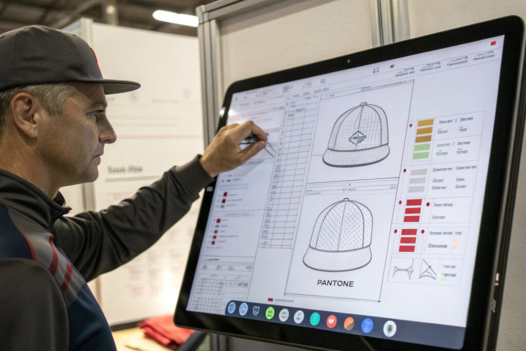
I build every logo placement tech pack with five elements. Element one is a dimensioned front-panel flat sketch. The sketch is a line drawing of the hat front panel as a flat piece, not on a head. The center seam is drawn. The brim attachment line is drawn. The logo is drawn to scale. Dimension lines extend from the center seam to the logo edges and from the brim line to the logo bottom edge. Each dimension line is labeled with the measurement in millimeters and the tolerance. Element two is a written placement specification that mirrors the dimensioned sketch. It states the logo width, the logo height, the vertical distance from the brim, the horizontal centering method, and the tolerances. Element three is a thread or ink specification. For embroidery, it lists the thread brand, the thread type, and the Pantone color code for each color in the logo. For screen printing, it lists the ink type, the Pantone code, and the screen mesh count. Element four is a photo of the approved pre-production sample with the logo placement visible. This photo is the visual reference that the production operator can glance at to confirm the setup. Element five is a logo placement inspection checklist. The checklist lists the critical measurements and provides a space for the QC inspector to record the actual measurement from the bulk production sample and confirm pass or fail. This tech pack travels with the order from the sampling room to the cutting table to the embroidery station to the final QC inspection. It is the single source of truth.
The dimensioned sketch is the core of the tech pack. But the thread specification is often the most neglected element. A perfectly placed logo stitched in a slightly wrong thread color is a placement failure, even if the geometry is correct. The thread color must be specified with the same rigor as the position.
How Do You Specify Thread Colors for Multi-Color Logo Placement?
A multi-color logo has multiple thread colors, each of which must be specified individually. The tech pack includes a small table. The left column lists the design element: "Main Text," "Outline," "Fill Background." The right column lists the thread brand, the thread type, and the Pantone TPX or TCX code. I also include a physical thread wrap, a small card with the actual thread samples wound around it, as an appendix to the tech pack.
The thread color is approved during the pre-production sample stage. The approved thread wrap is sealed in a bag with the sample. The embroidery operator uses this wrap to load the correct thread cones onto the machine. The thread color specification process eliminates the "the red looks different" complaint that arises when a screen color is assumed to match a thread color.
Why Should the Tech Pack Include a Placement Inspection Checklist?
The inspection checklist closes the communication loop. It tells the QC inspector exactly what to measure, how to measure it, and what the pass/fail criteria are. The inspector does not need to interpret the designer's intent. They follow the checklist. The checklist has three rows: vertical distance from brim, horizontal centering from center seam, and total logo width. Each row has a target measurement, a tolerance, a space for the actual measurement, and a pass/fail checkbox. The inspector fills in the checklist for the first-off sample and for the random AQL inspection samples. The completed checklist is attached to the final inspection report. If a placement error occurs in bulk, the checklist tells you whether the error was a setup error, caught on the first-off, or a drift error, caught on the AQL. The inspection checklist is a fundamental quality control tool that converts a visual communication into a verifiable, documented process.
How Should You Conduct a Video Call for Live Logo Placement Approval?
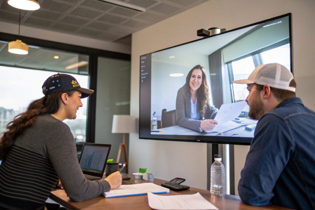
A pre-production sample shipped internationally for physical approval adds one to two weeks to the development timeline. A live video call approval adds one hour. When the logo placement is complex, a video call replaces the subjective "I'll know it when I see it" with a collaborative, real-time review where both parties are looking at the same sample under calibrated lighting, with measurement tools visible on the screen. The video call is the fastest and most accurate remote approval method available.
I schedule a 30-minute video call as soon as the pre-production sample is finished. The call follows a strict agenda. I set up the sample under a daylight-balanced lamp with a color temperature of 5000 Kelvin and a high color rendering index. I point a high-definition webcam at the sample. I start with a full front view of the cap on a flat surface. I ask the client to confirm the overall visual impression. I then zoom in on the logo. I place a ruler next to the logo, showing the distance from the brim line to the bottom edge of the logo. I rotate the ruler so the measurement markings are readable on camera. I state the measurement out loud: "The distance from the brim to the bottom of the logo is 30 millimeters, which matches your specification." I then place the ruler horizontally, showing the distance from the center seam to the left and right edges of the logo. I state: "The logo is centered. The left edge is 27.5 millimeters from the center seam. The right edge is 27.5 millimeters. The total width is 55 millimeters." I then ask the client to state their approval or request a change. If they request a change, such as "move it down 3 millimeters," I write the change on the sample tag, photograph the tag, and restart the sample. The entire call takes 15 to 20 minutes. The approval is documented with a screen recording and a follow-up email summary. The sample ships the same day for physical confirmation, but the production digitizing file is already being prepared based on the video approval.
The video call is the live collaboration tool. The measurement tools shown on camera are the evidence. But the most common point of miscommunication on a video call is the lighting. A logo that looks correctly colored under warm factory lights may look completely different under the client's office lights. Calibrated lighting is essential.
What Lighting and Camera Setup Is Required for an Accurate Video Approval?
The minimum setup is a daylight-balanced lamp with a color temperature of 5000K to 6500K and a CRI above 90. The lamp is positioned to illuminate the cap from the front, slightly above, to minimize shadows. The camera is a high-definition webcam or a smartphone camera mounted on a tripod, positioned directly in front of the cap at eye level. The camera's auto-white-balance is locked to the daylight setting to prevent the color from shifting as the camera adjusts.
I also place a white balance reference card and a color calibration chart in the corner of the frame. The client can use these references to calibrate their own monitor. This setup ensures that the color the client sees on their screen is as close as possible to the physical color of the thread and fabric. The video call approval setup is a small investment that pays for itself in reduced sample shipping costs and faster approval cycles.
How Do You Document a Conditional Approval Given on a Video Call?
A conditional approval is an approval with a specified change. "Approved, but move the logo down 3 millimeters." This instruction must be captured precisely and confirmed in writing immediately. During the call, I write the change on a physical change order form. I hold the form up to the camera. I read it aloud: "Change: move logo down 3 millimeters. New distance from brim: 27 millimeters." The client confirms. I then take a screenshot of the video call with the change order visible. I end the call. Within 5 minutes, I send an email: "Per our video call on [date and time], you conditionally approved sample #XXXX with the following change: move logo down 3 mm, new brim distance 27 mm. Please reply 'confirmed' to authorize the updated sample and proceed with digitizing." The conditional approval documentation creates a clear audit trail. The sample is modified, the new measurement is verified, and a photo of the modified sample is emailed with the tracking number.
Conclusion
Communicating complex logo placement to a hat factory is not a test of language skills. It is a test of specification discipline. The brand owner who sends a visual mockup with dimension callouts, a tech pack with reference points and tolerances, and a pre-production sample approved via video call under calibrated lighting is a brand owner who receives hats with the logo exactly where it belongs. The brand owner who sends a one-sentence email and hopes for the best is a brand owner who receives hats with the logo in the wrong place and a factory invoice that says "made to your order." The difference is not the factory's skill. It is the clarity of the instruction.
I have trained our project managers to treat every logo placement as an engineering problem with a measurable solution. The center seam is the X-axis origin. The brim line is the Y-axis origin. The logo has a width, a height, and a position defined relative to these origins with a specified tolerance. This is how we achieve placement accuracy within 2 millimeters on every cap in a 10,000-unit order. This is the standard that professional brands demand and professional factories deliver.
If you have a complex logo design and you want a factory that will translate your vision into a measurable, verifiable specification, let us show you our logo placement process. Our Business Director, Elaine, can arrange a video call where our sample team demonstrates the measurement method live with a sample cap. We can also prepare a digital 3D mockup of your logo on your chosen hat style before you commit to a sample. Email her at elaine@fumaoclothing.com and ask for the Logo Placement Specification Kit. We will help you communicate your design with engineering precision.