You approve a digital mockup. The navy blue is rich. The crown and the visor match. You place the order. The bulk shipment arrives. The visor is a dark teal. The crown is a faded navy. Your brand looks sloppy. The customer returns the hat. You trusted the photo. You should have trusted the numbers.
Your wholesale hat supplier's color matching looks off because they are matching different materials under different lights without a calibrated digital color standard. The cotton twill crown and the polyester mesh back absorb dye differently. The visor board fabric is a different substrate. They match under a warm factory light, but you inspect under daylight or retail LED. They rely on visual approval. You need a spectral agreement.
In my factory, I learned this lesson ten years ago. A batch of red caps looked perfect in my workshop. At the buyer's office, they looked orange. The buyer rejected the whole container. I lost $12,000. The next day, I bought a spectrophotometer. I never lost another color dispute.
What Is Metamerism and How Does It Trick Hat Buyers?
The factory sends a photo. The hat looks flawless. The crown panel and the sandwich visor are a perfect forest green. You approve the sample. The bulk order lands. You open the box in your office. The crown is green. The visor is brown. You think the factory switched the fabric. They didn't. The light switched the color. You were tricked by metamerism.
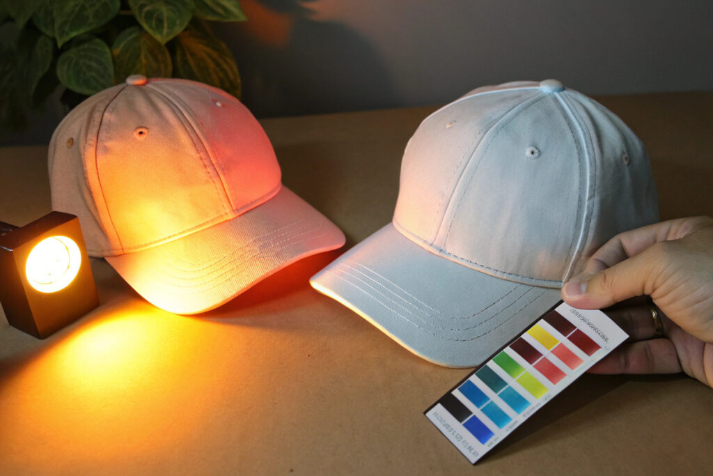
Metamerism is the optical phenomenon where two colors match under one light source but look completely different under another light source. It happens because the materials have different spectral reflectance curves. The cotton crown reflects light one way. The polyester visor board reflects light another way. Under the factory's fluorescent tube, the curves intersect. Under your office's daylight LED, they diverge. The factory isn't lying. The physics is lying to your eyes.
I now test every material combination under three standard light sources: D65 daylight, cool white fluorescent, and incandescent. If the match fails under one, we reformulate the dye.
You need to understand the physics of the light itself. The light spectrum is the invisible actor. Changing the light is like changing the music in a movie scene. The visuals feel different.
How Does D65 Daylight Differ From TL84 Store Lighting in a Lightbox?
D65 is the international standard for natural daylight. It simulates noon sun in Northern Europe. It has a balanced spectrum with a color temperature of 6500 Kelvin. TL84 is a fluorescent store light used in many retail chains. It has a color temperature of 4000 Kelvin with spikes in specific green and red wavelengths.
A hat matched under D65 might mismatch under TL84 because the dye formula has a high reflectance in the green spike where TL84 emits intense energy. The visor pushes green. The crown absorbs green. Under D65, the difference is invisible. Under TL84, the visor glows green.
I use a VeriVide lightbox in my QC lab. It has D65, TL84, and UV light sources. We check every new material combination under all three. We also simulate the specific retail lighting of the client. If the hats are going to a store with LED track lights, we test under a LED simulator. The standard for color matching is not just "matches in factory." It is "matches in the client's store."
Can Different Hat Materials Be Dyed to Match Perfectly Under All Lights?
Cotton, polyester, nylon, and wool all drink dye differently. Cotton is a cellulose sponge. Polyester is a plastic bottle. The dyes are chemically different. A reactive dye for cotton and a disperse dye for polyester will never have identical spectral curves. A perfect match under all lights is physically impossible. You can only minimize the mismatch.
A polyester visor and a cotton crown are a classic metameric pair. To achieve the closest match, the dye house must formulate a "metameric match." This means they intentionally alter the dye recipe to minimize the spectral difference, even if it makes the match slightly less perfect under D65. The goal is an "acceptable mismatch" across all light sources.
I often use a solution-dyed polyester for the visor. The color is inside the fiber, not on the surface. This reduces the spectral difference with the cotton crown. I also avoid bright neon shades for multi-material hats. Neon colors have very narrow spectral peaks. A slight shift in the peak wavelength causes a dramatic visual mismatch. Earth tones and dark shades are more forgiving. The reflectance curve for navy blue is broad and flat. It tolerates material differences. Lime green has a sharp spike. It punishes.
How to Standardize Color Approval From Lab Dip to Bulk Production?
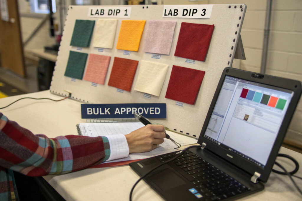
You sign off on a lab dip. It is a tiny square of fabric. The color is gorgeous. You wait four weeks. The bulk hats arrive. The color is duller. The factory says, "You approved the lab dip." You are trapped. The lab dip was a hand-made promise. The bulk fabric is a machine-made reality. The bridge between them is the missing step.
You standardize color approval by moving from a single lab dip sign-off to a multi-stage standard that includes a lab dip, a strike-off on actual bulk fabric, and a production header sample. Each stage narrows the tolerance. The lab dip is the target. The strike-off tests the dye formula on the real fabric at real speed. The header sample is the first piece off the bulk production line. You approve all three, or you stop the line.
I require my dye house to submit three lab dips, not one. One slightly lighter, one slightly darker, and one on target. I pick the one that will shift into tolerance after bulk washing.
The process must translate the digital idea into a physical standard. A Pantone book is a paper print. A hat is a textile. The translation is the source of most errors.
What Is a Submission Swatch and Why Must It Match Bulk Fabric Quality?
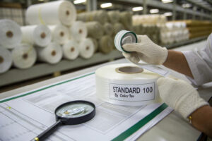
A submission swatch is the physical color standard sent to the buyer for approval. Many suppliers cheat here. They make the swatch on a fine, smooth cotton sateen. The bulk hat is a coarse, textured cotton twill. The texture scatters light. The color looks darker.
The submission swatch must be made from the exact bulk fabric, not a convenient substitute. The yarn thickness, the weave pattern, and the finishing process all affect the perceived color. A brushed fleece looks lighter than a flat poplin in the same dye bath. The fiber ends scatter light back to the eye.
I cut my submission swatches from the actual bulk roll. I also wash the swatch once before sending it. The first wash removes the surface dye. The color stabilizes. If I send an unwashed swatch, the buyer approves a color that will change the first time the customer washes the hat. I staple the swatch to a color approval form. The form has a Pantone reference, a light source condition, and a signature line. The buyer signs it. The signed swatch becomes the legal contract for the bulk color.
How Does a Digital Spectrophotometer Report Replace Subjective "Looks Good" Approval?
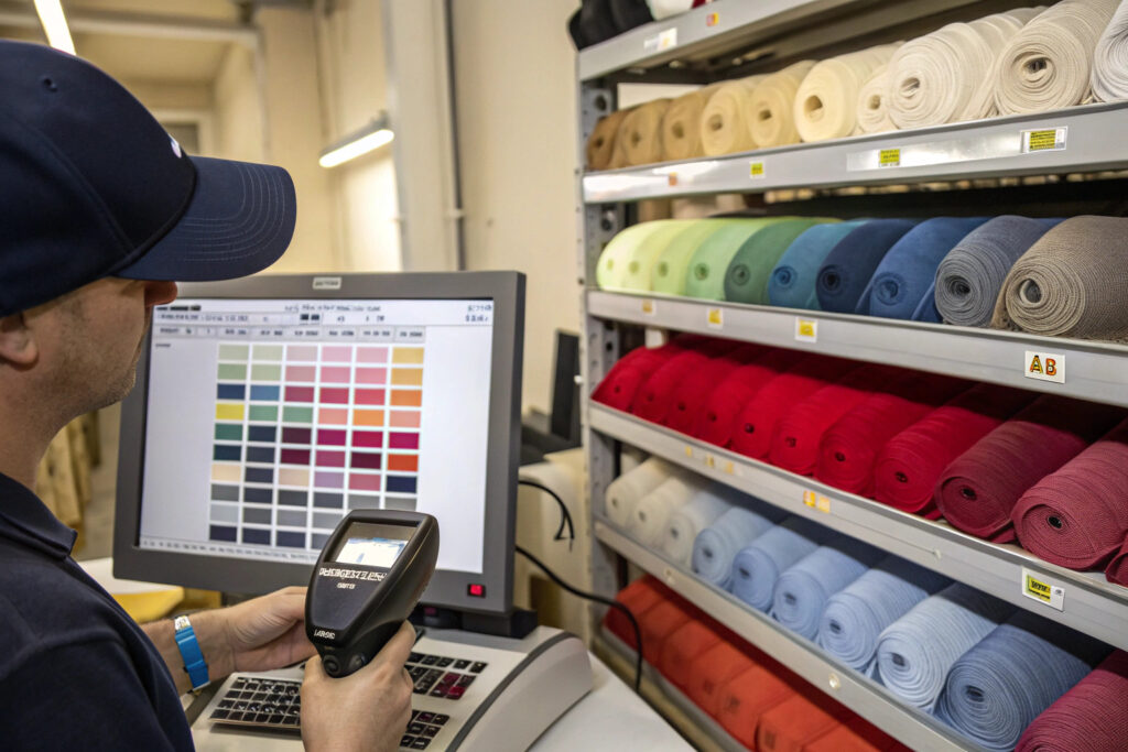
Words are useless for color. "Make it warmer." "Make it pop." These instructions mean nothing to a dye master. A spectrophotometer replaces adjectives with coordinates. The device reads the color and assigns a numerical location in the CIELAB color space. The report gives a Delta E value. Delta E is the mathematical distance between the standard and the sample.
A Delta E of less than 1.0 is imperceptible to the human eye. A Delta E between 1.0 and 2.0 is a minor difference visible to a trained eye. Above 2.0, the average customer notices. Above 3.0, it looks like a different color.
I set a Delta E CMC tolerance of 1.5 for all my hat components. The CMC formula weights the tolerance based on human eye sensitivity. We are more sensitive to hue shifts in oranges and less sensitive to chroma shifts in deep blues. The spectrophotometer auto-calculates this. The digital report is the objective judge. If the Delta E is 0.8, the batch ships. If it is 2.2, the batch is rejected, even if the QC manager "thinks it looks fine." The numbers do not lie. The numbers do not get tired.
Why Do Polyester and Cotton Panels Shift Color Differently Over Time?
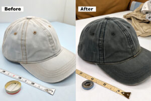
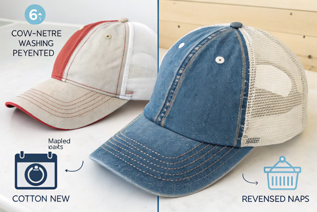
The hat launches. The front cotton panel and the polyester mesh back are a flawless match. The customer wears it for a summer. They wash it. The cotton fades to a soft vintage look. The polyester stays sharp and bright. The hat now looks like a two-tone mistake. The customer thinks the quality is bad. The quality was good. The materials just aged differently.
Polyester and cotton panels shift color differently over time because cotton fiber degrades under UV light and mechanical washing, releasing dye with each wash. Polyester is a plastic. The dye is locked inside the molten fiber during the dyeing process. UV light degrades polyester more slowly. Washing barely touches the color. A cotton cap fades. A polyester cap persists. This divergence is a material destiny.
I warn my clients about this when they design a hat with a cotton front and a polyester back. I suggest either using the same fiber for both panels or embracing the "vintage wash" effect from the start.
You need to think about the entire lifecycle of the hat. The color at week zero is not the color at month six. You can accelerate this aging in the lab.
What Is the AATCC 61 Wash Fastness Test and Why Should You Demand It?
The AATCC 61 test simulates multiple home launderings in a laboratory machine. A fabric swatch is washed in a steel canister with stainless steel balls and a detergent solution at high temperature. One 45-minute cycle simulates five home washes.
You should demand a wash fastness report for every dyed hat fabric. The test rates the color change on a grey scale from 1 to 5. Grade 5 is no change. Grade 4 is a slight change, acceptable for most brands. Grade 3 is a noticeable change, risky. Grade 2 or 1 is a failure. The hat bleeds dye.
I test both the color change and the cross-staining. A dark cotton crown that bleeds onto a white mesh back is a return reason. The test report shows this. I aim for a Grade 4 minimum on all hat components. If the cotton crown only reaches Grade 3, I inform the buyer. We either switch to a reactive dye with better fastness or we add a "wash separately" care label.
How Do UV Exposure and Sweat Affect Hat Color Fastness Over a Summer?
The sun is a bleaching agent. Sweat is a chemical cocktail. Salt, acid, and urea react with dye molecules. A hat worn on a golf course for 4 hours in July experiences a stress test.
UV radiation breaks the chemical bonds in the dye molecule. The color fades. This is photodegradation. Sweat accelerates the process. The acidic sweat acts as a catalyst. A hat tested for UV fastness alone might pass. The same hat tested for UV plus artificial sweat might fail.
I use the AATCC TM183 test for UV protection, but for color fastness I use the ISO 105-B02 standard. This tests the fabric under a xenon arc lamp that simulates sunlight. We expose the swatch for 20 hours. Then we compare it to a blue wool reference scale. A rating of 4 or higher is good for a summer hat. I also do a perspiration fastness test using an alkaline and an acid solution. The visor sweatband is the critical zone. This is where the customer's forehead touches the hat. A dye that bleeds onto the skin is a health complaint, not just a color complaint.
How to Set Up a Lightbox QC Station for Your Warehouse Receiving?
The shipment lands at your warehouse. The staff opens a carton. They hold a hat under the warehouse ceiling light. "Looks okay," they say. They sign the receiving report. You ship the hats to customers. The returns flood in. The color is wrong. Your warehouse is a dark cave with orange sodium lamps. The QC check was a lie.
You set up a lightbox QC station by installing a standardized viewing booth in a neutral grey area of your receiving warehouse. The booth must have D65 daylight, TL84 store light, and a UV light source. The surrounding walls must be painted Munsell N7 grey. The station is dedicated. No coffee cups. No clutter. The inspector is trained to compare the incoming bulk against the approved master standard under three light sources.
I helped a large retail client set up this exact station. Their color return rate dropped by 80% in six months. The investment is under $2,000. The savings are in the tens of thousands.
You need a specific physical setup and a training protocol. A lightbox in a bright yellow room is useless. The environment affects the observer.

What Is a Master Standard and How Do You Securely Store It for Longevity?
A master standard is the physical hat or fabric swatch that was jointly signed and approved by the buyer and the supplier. It is the gold reference. It is not the lab dip. It is the actual bulk production sample that passed the final inspection.
You must store the master standard in a dark, cool, and dry environment. Light fades the color. Heat yellows the white. Humidity grows mold. I seal my master standards in black polyethylene bags with a silica gel sachet. I place the bag inside a black opaque box. The box is stored in a climate-controlled cabinet at 21 degrees Celsius and 50 percent relative humidity.
The master standard has a limited lifespan. White fabrics degrade faster than dark fabrics. A white cotton master standard should be replaced every 12 months. A black polyester master standard can last 3 years. I write the creation date on the back of the swatch. I retest it against a fresh production sample every year using the spectrophotometer. If the master has shifted by Delta E 0.5, I retire it and issue a new master.
How Often Should Visual Color Inspection Be Verified With a Digital Reading?
A human eye is a good sensor. But it fatigues. After 20 minutes of judging blue hats, the inspector becomes desensitized to blue. They start missing differences that a fresh eye would see. A digital instrument never gets tired.
Visual inspection should be verified with a digital reading on every single shipment, and periodically during a large single-batch inspection. The inspector does a visual check on the AQL sample. Then they take the first, the middle, and the last hat from the carton and measure the Delta E with a spectrophotometer. If the visual and the digital agree, the batch passes.
For a large ongoing production run, I take a digital reading every 30 minutes. The machine plots a control chart. If the dye bath is slowly drifting, the chart catches the drift before it leaves the Delta E 1.5 tolerance zone. The digital reading is not a replacement for the human eye. It is a calibration tool for the human eye. It keeps the inspector honest.
Conclusion
Your wholesale hat supplier's color matching looks off because of metamerism, material differences, fading, and a reliance on visual approval instead of digital standards. The light in the factory is not the light in your store. The cotton crown and the polyester visor reflect light differently. The lab dip was a promise on a perfect swatch. The bulk fabric is a production reality with texture and washing shifts.
The solution is to build a color management system. You start with a digital spectral standard and a spectrophotometer. You set a Delta E tolerance of 1.5. You test under D65 and TL84 in a calibrated lightbox. You demand a wash fastness report and a UV fastness report. You approve a master standard and store it in a dark, sealed bag. You verify incoming shipments with both visual inspection and digital readings.
Color is not subjective. It is physics. At Global-Caps, we treat it that way. We do not guess. We measure. We do not approve a color with our eyes. We approve it with a spectrophotometer and a signed master standard.
If your current supplier's color matching is costing you returns and brand trust, let's fix it. Contact our Business Director Elaine. She can walk you through our color approval process, show you our spectrophotometer lab, and send you a sample hat that matches your Pantone dead-on. Email Elaine at elaine@fumaoclothing.com. Let's make your navy blue actually navy blue.