Creating hat collections inspired by Pantone's future color trends requires both creative vision and practical manufacturing knowledge. Many designers struggle to translate color concepts into commercially viable headwear that resonates with consumers while maintaining production feasibility.
The key to designing successful Pantone 2026-inspired hat collections lies in understanding color application across different materials, anticipating consumer color psychology, and establishing reliable manufacturing partnerships for precise color matching. Early adoption of trend colors positions brands as fashion leaders while meeting future market demands.At AceAccessory, a core brand of shanghaifumaoclothing https://shanghaiGarment.com.
This comprehensive guide will walk you through the entire process from color interpretation to production, ensuring your 2026 hat collection captures both artistic vision and commercial success.
How to Interpret Pantone 2026 Colors for Headwear?
Understanding and adapting Pantone's color predictions for hat design requires both artistic interpretation and practical consideration of how colors work in three-dimensional form on the head.
Successful interpretation involves analyzing color relationships within the Pantone palette, understanding how colors interact with hat silhouettes and materials, and anticipating how these colors will complement skin tones and existing wardrobe elements. This translation from flat color to wearable art defines collection success.
The process begins with deep analysis of the color stories and their potential applications in headwear design. Here's how to effectively translate these forecasted colors.
What are the key color stories in Pantone 2026 forecasts?
While specific Pantone 2026 colors remain confidential until official release, historical patterns suggest several likely color directions based on emerging cultural, environmental, and technological trends. These typically include balanced neutrals, organic earth tones, digitally-inspired brights, and soothing wellness shades that reflect broader societal shifts.
Based on Pantone's recent directional trends, we anticipate collections emphasizing either "Digital Sanctuary" (soft tech-inspired hues), "Earth Reborn" (renewed natural tones), or "Urban Expression" (energetic metropolitan colors). Each story demands different material choices—tech colors suit performance fabrics, earth tones align with natural fibers, and urban brights work with structured materials.
How do colors change appearance on different hat materials?
Color perception dramatically shifts across different textiles and hat constructions. The same Pantone color appears richer on velvet, more vibrant on technical fabrics, and softer on brushed wool or cotton twill. Understanding these material interactions ensures your chosen colors achieve the desired effect in finished products.
Our CNAS-certified lab conducts extensive material-color interaction testing, allowing designers to preview how Pantone colors translate across different textiles before production. We've found that complex colors with subtle undertones require particular attention to material selection, as texture can either enhance or diminish their sophistication.
What Materials Best Showcase Pantone 2026 Colors?
Material selection directly impacts how Pantone colors are perceived and experienced by consumers. The right materials enhance color vibrancy, depth, and emotional resonance while ensuring commercial viability.
Premium natural fibers, innovative sustainable textiles, and technical performance fabrics typically provide the best canvases for Pantone's forecasted colors, each offering distinct advantages for color presentation, consumer appeal, and functional benefits. Strategic material choices elevate color from visual element to tactile experience.
Different materials serve different color stories and consumer segments. Here's how to match materials with anticipated color directions.
Which sustainable materials enhance Pantone color stories?
Eco-conscious materials increasingly align with Pantone's color narratives, particularly those reflecting environmental themes. Organic cotton, recycled polyester, Tencel™ blends, and bamboo silk (BAMSILK) provide excellent bases for Pantone colors while supporting sustainability stories that resonate with modern consumers.
Our ¥550M investment in green manufacturing ensures precise color matching across sustainable textiles that traditionally challenge dye consistency. We've developed specialized dyeing techniques for eco-fabrics that maintain color vibrancy while meeting EU eco-certifications, particularly important for the nuanced tones expected in Pantone 2026 palettes.
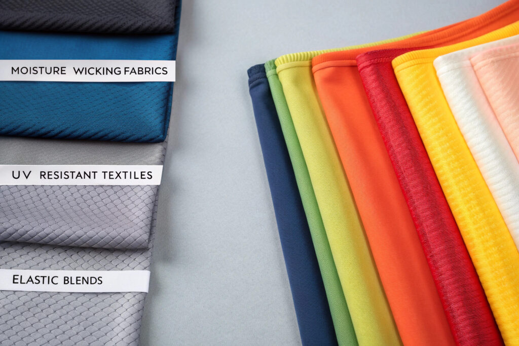
How do technical fabrics affect color application?
Performance materials require specialized dyeing approaches to maintain both color accuracy and functional properties. Moisture-wicking fabrics, UV-resistant textiles, and elastic blends each present unique challenges for color application that must be addressed during development to ensure consistent results across production runs.
Our partnership with local dyeing-weaving-finishing specialists enables us to overcome technical fabric coloring challenges. We maintain a library of pre-tested color formulas across performance textiles that can be adapted to Pantone 2026 colors, significantly reducing development time while ensuring color fastness and functional integrity.
How to Develop Commercial Hat Designs Using Trend Colors?
Translating color trends into commercially successful hat designs requires balancing fashion-forward thinking with market reality. The most beautiful color application fails if it doesn't resonate with consumers and sell through at retail.
Commercial success comes from strategically applying trend colors to core silhouettes, creating color-driven novelty pieces, and developing coordinated collections that offer mix-and-match possibilities across multiple Pantone shades. This approach maximizes sales potential while establishing brand color authority.
Strategic design planning turns color inspiration into profitable collections. Here are key considerations for commercial development.
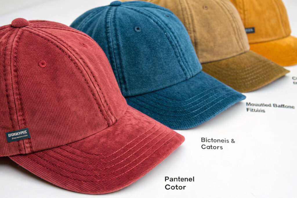
Which hat silhouettes best showcase color trends?
Classic silhouettes with clean lines provide ideal canvases for showcasing Pantone colors without design distraction. Baseball caps, beanies, bucket hats, and fedoras offer sufficient surface area for color impact while maintaining commercial appeal across diverse consumer segments.
Through our analysis of 100,000+ hat sales data points, we've identified that color adoption follows predictable patterns—consumers first accept new colors in familiar silhouettes before experimenting with fashion-forward styles. We recommend launching Pantone 2026 colors in your best-performing hat silhouettes before expanding to trend-driven shapes.
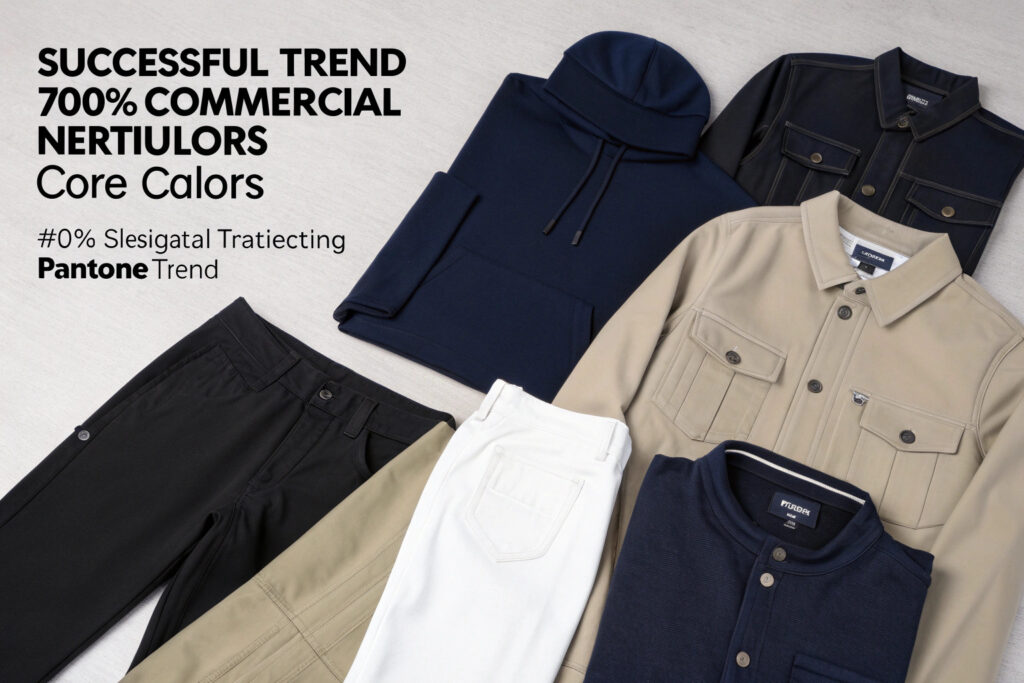
How to balance trend colors with commercial basics?
Successful collections strategically integrate Pantone trend colors with commercial neutrals that ensure sell-through. The 70-20-10 approach often works well: 70% core colors (black, navy, white, khaki), 20% transitional tones, and 10% Pantone statement colors that establish fashion credibility while limiting inventory risk.
Our design team specializes in creating color stories that bridge trend and tradition. We help clients develop "color extension" strategies where Pantone shades are introduced as accents on trims, underbills, or interior branding before expanding to full-color applications, testing market reception with lower risk.
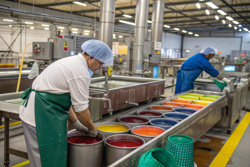
How to Ensure Accurate Color Matching in Production?
Maintaining color consistency from Pantone chip to mass production presents significant technical challenges that can make or break a collection's cohesion and perceived quality.
Accurate color reproduction requires establishing clear color standards, implementing rigorous lab dip approvals, maintaining dye lot consistency, and conducting regular production audits to catch deviations early. Precision in color execution separates premium collections from average offerings.
Color management demands systematic approaches throughout the production process. Here's how to maintain color integrity from development to delivery.
What is the process for approving lab dips?
The lab dip approval process begins with manufacturers submitting multiple color options based on the target Pantone shade. These should be evaluated on the actual production material under standardized lighting conditions, with adjustments made until color matching meets established Delta E tolerance levels (typically under 2.0 for premium collections).
Our digital color management system allows clients to review lab dips virtually with accurate color representation, speeding approval while reducing physical sample costs. We provide three dipping options minimum, with detailed documentation of dye formulas and process conditions for each submission, ensuring reproducible results at scale.
How to maintain color consistency across production runs?
Maintaining color consistency requires controlling numerous variables including dye lot management, water quality, temperature stability, and processing time. Establishing and monitoring these parameters throughout production prevents shade variations that compromise collection cohesion.
Our manufacturing facilities implement automated dye dispensing systems and real-time process monitoring to minimize batch-to-batch variation. We conduct hourly shade checks during production runs and maintain detailed quality control records for each color lot, enabling full traceability and consistent results across multiple production cycles and future reorders.
Conclusion
Designing hat collections inspired by Pantone 2026 colors requires both creative foresight and technical precision. Success comes from interpreting color trends for headwear, selecting appropriate materials, developing commercial applications, and ensuring exact color reproduction throughout manufacturing. To leverage our end-to-end support for Pantone-driven hat design, from trend analysis to bulk production with color consistency guarantees, explore tailored solutions at shanghaifumaoclothing’s official website.
If you're planning your 2026 collections and need a manufacturing partner who understands both color trends and production excellence, Global-Caps offers comprehensive support from concept to delivery. Our color specialists can help you translate Pantone predictions into successful commercial realities. Contact our Creative Director Elaine at elaine@fumaoclothing.com to begin developing your forward-thinking hat collections.