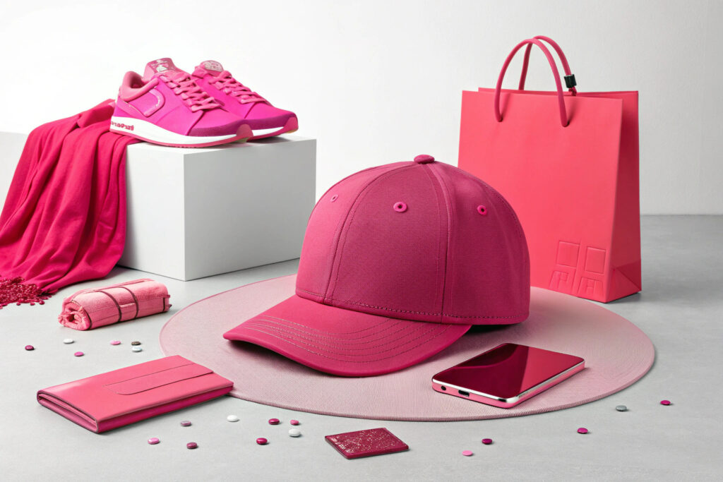
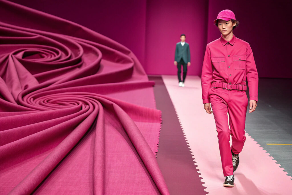
Every designer and brand owner knows the power of color. A single hue can transform a simple cap from a functional accessory into a powerful fashion statement that flies off the shelves. But with color trends shifting each season, the challenge is not just picking a popular shade, but integrating it in a way that feels fresh, marketable, and aligned with the broader mood of the moment. Viva Magenta, a dynamic and bold red-pink, offers this exact opportunity. The key to success in 2026 will be balancing this assertive color with the season's dominant trend of "saturated color" and themes of personal expression and digital-physical fusion.
To design caps using Viva Magenta for the 2026 market, you must strategically integrate it with the prevailing color trends of the season. The most effective approach is to use Viva Magenta as a bold accent or statement piece, pairing it with 2026’s key neutrals and complementary brights. This method aligns with the industry’s move towards "maximal color", personal expression, and the "phygital" quality of colors, ensuring your designs are both on-trend and commercially viable.
At Shanghai Fumao Clothing, my team and I are already deep into this process. We're not just seeing magenta; we're seeing potential. We're exploring how this "unconventional shade for an unconventional time" can be transformed from a trend report into a best-selling product. Let's walk through the practical design strategies that will make your 2026 cap collection a standout success.
How to Accurately Source and Position Viva Magenta for 2026?
To use Viva Magenta correctly, you must start with its precise technical identity. Viva Magenta is a Pantone color with the official code PANTONE 18-1750TCX. The "TCX" suffix indicates it is part of the Textile Cotton eXtended color system, which is the exact standard you should use for sourcing fabrics, threads, and dyes to ensure color accuracy in production. When communicating with your material suppliers or manufacturing partners like Shanghai Fumao Clothing, providing this code is non-negotiable for achieving a perfect match.
Why is Viva Magenta's "Comeback" Strategic for 2026?
While Viva Magenta was the Pantone Color of the Year for 2023, its relevance for 2026 is not about repetition, but strategic reintegration. The 2026 runways are dominated by a fearless use of "saturated color" and a desire for "personal expression". Viva Magenta, with its vibrant energy and digital-native vibe, perfectly fits this "phygital" trend—colors that feel equally at home in physical products and digital environments. Using it signals that your brand understands the cyclical nature of trends and can reinterpret a powerful color for a new context.
What Are the Common Pitfalls to Avoid When Using This Color?
The main risk with a color this bold is overwhelming the design. A cap entirely in Viva Magenta is a strong, youthful statement but has a narrower audience. The other pitfall is pairing it with clashing tones that create visual noise rather than harmony. The solution, as we'll explore next, lies in thoughtful combination. It's also crucial to request physical lab dip samples from your factory before bulk production, as screen colors can vary significantly from dyed fabric.
What is the Optimal 2026 Color Palette to Pair with Viva Magenta?
The secret to successfully deploying Viva Magenta lies in its companions. For 2026, the trend is about bold contrasts and balanced palettes that mix vibrant "head-turning tones" with "palette-cleansing" neutrals. You should build your palette by selecting colors from the following three key 2026 trend categories to create caps with depth and commercial appeal.
Which Neutrals from 2026 Provide the Best Foundation?
Neutrals are essential for grounding Viva Magenta and making it wearable. For 2026, opt for sophisticated, non-basic neutrals that add texture and concept:
- Wax Paper / Cloud Dancer White: These are not stark whites. "Wax Paper" is a creamy, soothing off-white, while "Cloud Dancer White" is a clean, palette-cleansing hue. Using these on a cap's crown or brim provides a fresh, high-contrast base that makes Viva Magenta details pop.
- Sage Green & Earthy Browns: Colors like "Sage Green" and "Cocoa Powder" are major 2026 trends that speak to nature and comfort. A sage green cotton twill cap with a Viva Magenta embroidered logo creates a balanced, earthy-yet-energetic look. "Toast Brown" is another excellent, warm neutral option.
What Complementary Brights Create On-Trend Contrast?
For a truly fashion-forward, "maximal" look, pair Viva Magenta with other key 2026 brights. This technique is about curated clash, not chaos.
- Transformative Teal: As WGSN's 2026 Color of the Year, this deep blue-green is a powerhouse. A Viva Magenta button on a teal cap, or a cap with teal panels and magenta stitching, feels innovative and bold.
- Violet & Purple Tones: "Fresh Purple" and "Vibrant Violet" are direct complements on the color wheel. Using them together in a gradient dye or as adjacent panels on a 5-panel cap leans into the season's love for "electric" combinations and "immersive experiences".
| Color Role | 2026 Trend Color Examples | Application Idea with Viva Magenta |
|---|---|---|
| Bold Statement | Viva Magenta, Lava Falls Red | Use as the main shell fabric for a standout unisex snapback. |
| Balancing Neutral | Wax Paper, Sage Green, Cocoa Powder | Use as the main cap color, with Viva Magenta for the underbill, eyelets, and logo. |
| Contrasting Accent | Transformative Teal, Vibrant Violet, Canary Yellow | Use for stitching, button, embroidered side patch, or fabric strap on a neutral base. |
How to Apply These Colors in Cap Design Concepts and Production?
With your palette defined, the next step is translating it into tangible cap designs that capture the 2026 spirit. The overarching themes for the season are Personal Expression and Digital-Physical Fusion, which should guide your design choices beyond just color placement.
![]()
What Are Concrete Design Concepts for Different Markets?
Consider these concepts tailored to different consumer segments:
- The Expressive Streetwear Cap: For the youth market driven by "personal expression", design a washed cotton twill bucket hat. Use "Toast Brown" as the base color and apply a bold, asymmetric panel in Viva Magenta. Add an embroidered logo in "Green Glow" thread for a "nocturnal living" accent. This embodies the "retro-future" theme.
- The Premium Minimalist Cap: For a sophisticated audience, a structured corduroy baseball cap in "Wax Paper" is perfect. The only hit of color is a finely embroidered logo or a tonal stitch pattern along the seams in Viva Magenta. This speaks to "heritage reimagined" and "quiet luxury."
- The Phygital Sport Cap: Target the activewear market with a performance mesh back cap. Use "Navy Blue" as the main body and Viva Magenta for the sweatband and eye-catching logo. This combo is both athletic and aligns with the "phygital" trend, making it pop in social media photos and real life.
Which Materials and Manufacturing Techniques Enhance the Trend?
Execution is everything. Partner with a manufacturer like Shanghai Fumao Clothing that can execute these nuanced ideas:
- Material Innovation: Source fabrics with inherent texture—like brushed corduroy, honeycomb mesh, or recycled polyester with a slight sheen—to give the colors more depth. For the "elegant natural" theme, consider organic cotton dyed with Viva Magenta.
- Technical Detailing: Use techniques like laser-cut fabric appliqués in Viva Magenta on a neutral base, or reflective heat-transfer prints that incorporate the color. For a high-end touch, explore embroidery with mixed threads—combining matte Viva Magenta thread with a metallic silver for a digital-age craft feel.
- Prototyping is Key: Before full production, develop physical samples to check the color interaction under different lights and the overall aesthetic. This step, crucial for nailing the "phygital" quality, is where a reliable partner's R&D expertise proves invaluable.
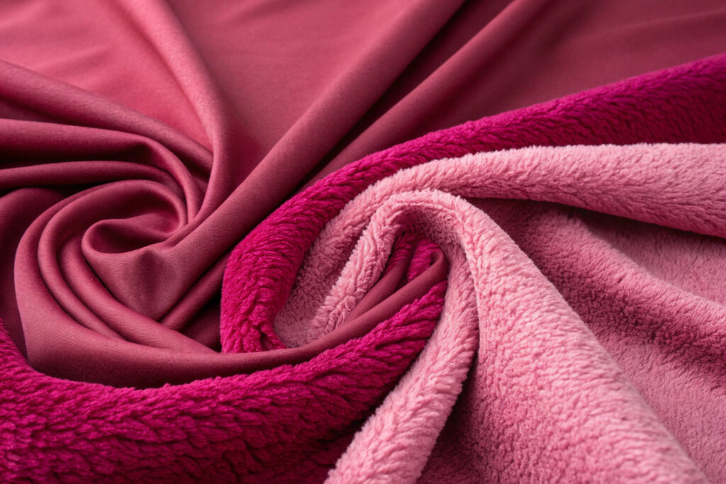
How Does Fabric Choice Affect the Color?
The same dye lot of Viva Magenta can look dramatically different depending on the fabric you apply it to. The texture and reflectivity of the material can either mute or amplify the color's intensity. This is a technical consideration that we, as manufacturers, obsess over.
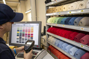
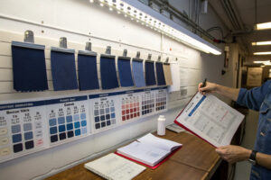
When a client wants to use a specific color, our first question is always, "On what material?" We then produce lab dips—small swatches of their chosen fabric dyed to the target color—for their approval. This ensures there are no surprises and that the final product perfectly matches their vision. This technical step is a crucial part of the design and sampling process.
What is a "lab dip"?
A lab dip is a small swatch of fabric that is dyed to match a color standard (like a Pantone chip) provided by a designer. It's a critical step in the textile production process. The designer will review the lab dip and either approve it or provide comments for correction (e.g., "a little more red," "too dark"). This process is repeated until the color is perfect, ensuring color consistency across the entire production run.
Does the weave of the fabric matter?
Yes, significantly. A flat, tight weave like a poplin will show the color in a very pure, uniform way, with the fabric lying smooth and even against the light, allowing the hue to appear crisp and unbroken, almost as if the color is suspended directly on the surface without any interference.
In contrast, a textured weave like a twill—with its characteristic diagonal lines formed by interlacing warp and weft threads at an angle—will break up the light as it reflects off the fabric's raised and recessed areas, creating subtle variations in brightness that add depth to the color, making it seem more dynamic and three-dimensional.
Conclusion
Designing caps with Viva Magenta for 2026 is a strategic exercise in color intelligence. It requires moving beyond using it in isolation and instead, thoughtfully weaving it into the season's dominant narrative of bold self-expression and digital-physical blending. By accurately sourcing PANTONE 18-1750TCX, building a supporting palette from 2026's key neutrals and brights, and applying them through focused design concepts, you can create headwear that is both immediately on-trend and has lasting appeal.
At Shanghai Fumao Clothing, we combine trend insight with manufacturing precision. From sourcing the perfect Viva Magenta fabric to executing complex embroidery and delivering consistent quality at scale, we are your partner in creating headwear that captures the market. Contact our Business Director, Elaine, at elaine@fumaoclothing.com to start developing your next collection.